Pay Minimum Tax Website Ui&Ux

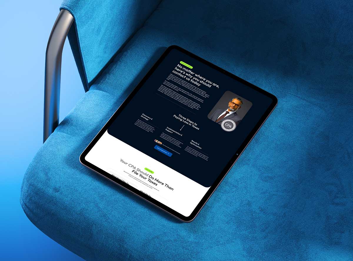
A website designed for a tax advisory firm helping US-based clients legally minimize what they owe, built around clarity and trust rather than legal jargon.

Client

Pay Minimum Tax

Industry

Tax Advisory and Financial Services

Services

UI/UX Design · UX Writing

Project Description

The client is a tax advisory firm serving US-based individuals looking to legally reduce their tax burden. Tax strategy is a category built on trust, since clients are handing over sensitive financial decisions to someone they’ve likely never met in person. The website needed to make that trust possible from the first visit, communicating expertise and results without leaning on the kind of dense legal language that makes people leave a page.

Making Tax Strategy Feel Approachable, Not Intimidating

Tax minimization sits at an odd intersection: it’s a serious financial decision, but most people arrive at the site anxious or confused, not informed. The site had to lower that barrier without oversimplifying what’s actually a technical service.

Problem #1

Trust without a face to face meeting

Clients are handing over financial details to a firm they found online. The design had to build credibility fast, before a single conversation happens.

Problem #2

Serious service, simple language

Tax law is complicated. The site needed to explain real value, legal tax minimization strategies, without sounding like a legal disclaimer.

Problem #3

Conversion without overpromising

A tax minimization pitch can tip into sounding too good to be true. The site had to make a compelling case for real savings while staying credible enough that a financially cautious audience wouldn’t bounce.

Objectives

The firm needed a website that could turn an anxious search, "how do I pay less in taxes," into a booked consultation. The goal was positioning the firm as the clear, credible answer to that question rather than one more result in a crowded field of tax advisory sites that all sound the same.

Requirements

The design needed to explain the firm's approach to legal tax minimization in plain language, build enough credibility that a financially cautious US audience would trust a firm they'd never met, and keep the path from landing page to consultation request short enough that interest didn't cool off before someone reached out.

Solutions

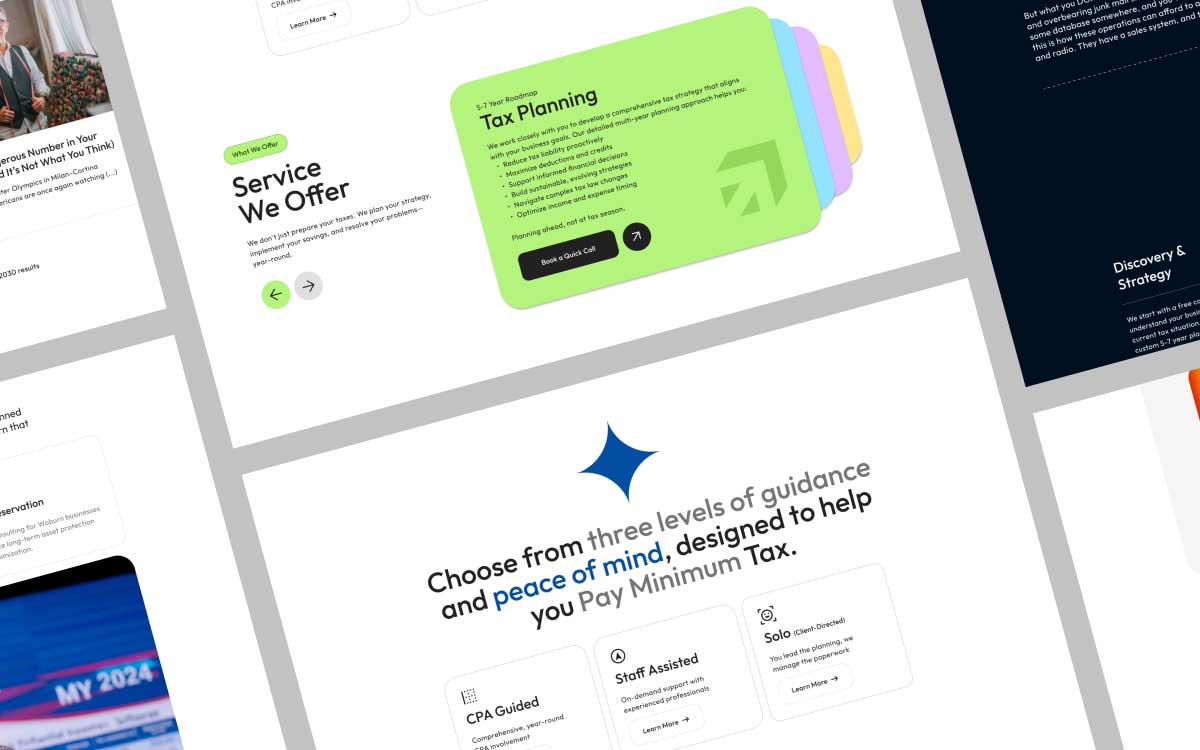
We designed a Figma-first website centered on a direct, confident value proposition, paying the legal minimum, not more. The layout leads with that promise, backs it up with clear explanations of how the strategy works, and moves visitors toward a consultation request without burying the call to action under legal disclaimers.

Clarity Over Complexity

A financially cautious audience doesn’t respond to jargon. Every design decision worked backward from one goal: make a serious service feel understandable in under a minute.

Discovery

Mapped what a first time visitor actually worries about when searching for tax help, then built the site’s structure around answering that worry early.

Strategy

Defined a content hierarchy that leads with the core promise, paying the legal minimum, before asking visitors to trust the firm with more detail.

Design

Designed the full site in Figma, balancing a confident, benefit led headline against the credibility signals a financial services audience expects.

Delivery

Delivered a complete Figma design file, ready to guide either an in house build or a development handoff.

Style Guide & Component

tapin typhography

Color Story

Decoration is distraction.
Every pixel serves a purpose.
A system built not to be seen, but to be felt.

Visual Output

Delivered a clean, trust first website design, built to turn an anxious tax question into a booked consultation.

From Anxious Search to Confident Consultation

quote icon

Pay Minimum Tax now has a website that answers its visitors’ biggest question right away, then gives them a clear, low friction path to booking a consultation instead of losing them to hesitation.

Md. Sabir - client- Contentking ltd

Simon Sabir, cpa

Pay Minimum Tax

Timeline

2 week

Idea to UI/UX Design

Share this Case Study:

Where Hesitation Turns Into a Booked Call

The site finally sounds like us: direct, no fine print, no jargon. Visitors know exactly what we do in the first few seconds.

Have a similar challenge?

A live product, a half-finished Figma file, or just an idea in your head. We’ll look at it and tell you what we’d actually do.

Related Projects